| Patch scales used |
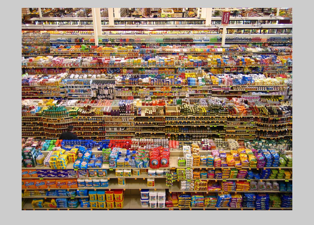
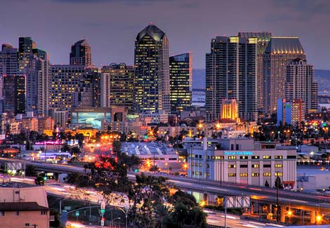
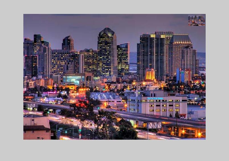
Input image |
Result image |
|
Some test images to verify that my algorithm is doing what I would expect for obvious test cases.
|
| 0.09, 0.10, 0.11, 0.12, 0.13 |
 |
 |
| 0.09, 0.10, 0.11, 0.12, 0.13 |
 |
 |
|
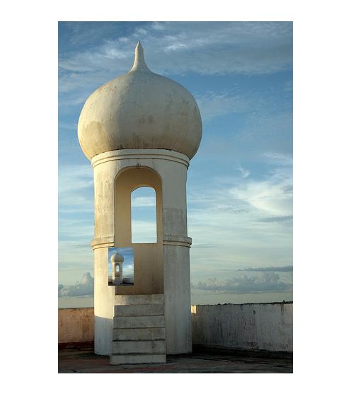
Test 3 initially did not behave as I had expected, but after considering the difference in line thicknesses between the scaled down version and the original version, it makes semse. (note that I'm currently taking the first 'best' match, when there are many tied best positions). It's an interesting test case though, because perceptually it would probably work better in the center, despite the fact that there's actually a higher color difference for the pixels and the fact that the gradients do not line up at all. Perhaps an interesting thing to look into might be some way of estimating a scale invariant gradient measure: something that might look for 'lines' that are defined by two close complementary gradients--one positive and one negative--and then yield a high response in the middle of those two gradients (essentially defining the 'middle' of the line). Then lines of slightly different widths would still elicit a high gradient repsonse when lined up, rather than the opposite.
|
| 0.09, 0.10, 0.11, 0.12, 0.13 |
 |
 |
| 0.09, 0.10, 0.11, 0.12, 0.13 |
 |
 |
| 0.09, 0.10, 0.11, 0.12, 0.13 |
 |
 |
|
Note that failing to fully explore enough patch sizes for good matches can result in missing out on a good, obvious match. In this case, when I constrained the fractal image to only look at one particular patch scale (that happened to be smaller than what results in a close match in the first example), the end result is pretty bad.
|
| 0.09, 0.10, 0.11, 0.12, 0.13 |
 |
 |
| 0.09 |
|
 |
|
In this case, it's not immediately obvious where the patch ends up in the resulting image (although once I found it, it became more obvious). But in this case I think it leverages simply the look of the input image, and doesn't necessarily exhibit a good match with the underlying image patch.
|
| 0.09, 0.10, 0.11, 0.12, 0.13 |
 |
 |
| 0.09, 0.10, 0.11, 0.12, 0.13 |
 |
 |
| 0.08, 0.09, 0.10, 0.11, 0.12 |
 |
 |
|
Here's an example of a pretty bad failure.
|
| 0.09, 0.10, 0.11, 0.12, 0.13 |
 |
 |