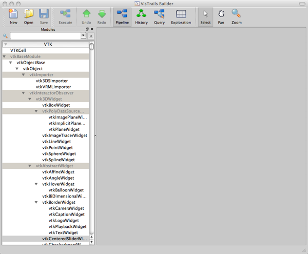
Figure 1. VisTrails Builder window.
Download this zip file for the files needed in the tutorials.
This example will introduce basic concepts including loading data files, interacting with workflow modules and 3D visualizations, and saving data files. If you are not familiar with VisTrails, you may want to read the relevant material in the VisTrails User's Guide before working through this example.
This tutorial assumes that you have not performed any actions before following the tutorial steps. To start VisTrails on Windows, go to Start/All Programs/VisTrails/VisTrails.
On the left side of the VisTrails Builder window is a tree view of all the packages available in VisTrails. A package is a set of modules that you can add to your visualization workflow. We'll focus primarily on the VTK package in this tutorial. The VTK package is listed at the top of the list of available packages. Expand the VTK package so that the plus sign to the left of the VTK label turns into a minus sign (on my Mac, the plus/minus signs are replaced with triangles pointing to the right/down). Also, expand the vtkBaseModule item to see all the available VTK modules. Your window should look as in Figure 1.
Figure 1. VisTrails Builder window.
The number of modules in VTK is quite large. Rather than look through the entire list to find a particular module, you can quickly find it by typing in the name of the module in the search box above the list of packages. We'll add a module to read in the data for this tutorial. In the search box, type 'vtkXMLImageDataReader'. As you type, the list will be filtered to exclude any modules whose names do not contain the string you have entered so far. This can be useful for finding all types of file readers, for example, simply by entering 'Reader' into the search box.
To add the vtkXMLImageDataReader, click on it and drag it to the interaction canvas located in the central portion of the window. It should look like Figure 2.
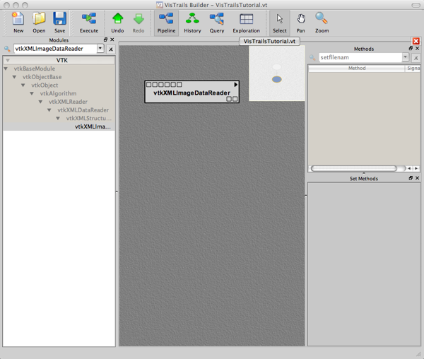
Figure 2. vtkDataSetReader starts off the workflow.
Now we need to tell the vtkXMLImageDataReader where to find the file for the tutorial. On the upper right side of VisTrails Builder window, locate the 'Method' panel. Locate the SetFileName method under vtkXMLReader. You can enter 'SetFileName' into the search box at the top of the panel to find it quickly. Click and drag this item down to the 'Set Methods' panel just below so that it looks like Figure 3. Click on the folder icon to the right of the text field. This will bring up a file navigation dialog box. Navigate to where you extracted the data files for this tutorial and select elevation_small.vti. Click the Open button.
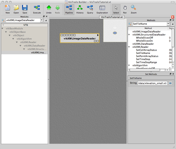
Figure 3. Setting the file name.
To make sure our data reader can successfully read the file, click the Execute button on the tool bar at the top of the window. The vtkDataSetReader should turn to a green color. This indicates that the file was loaded successfully. If it turned red instead, the file was unable to be loaded. To see what went wrong, hover the mouse cursor over the module, and an error message should appear indicating what went wrong. In fact, any module may encounter an error, and you can interrogate the error by hovering the mouse over it in this way.
The file you just loaded contains structured point data of the elevation of a valley surrounded by mountains. It is from the US Geological Survey.
Now we will begin the process of turning the data you just loaded into a visualization. A mapper is responsible for turning your data into drawing commands that will be executed when your visualization is rendered to the screen. Several kinds of mappers exist, but you will most often use vtkDataSetMapper and vtkPolyDataMapper. Add a vtkDataSetMapper to the work flow below the vtkXMLImageDataReader. Connect the two modules by clicking on the leftmost box at the bottom right of the vtkXMLImageDataReader and dragging to the leftmost box on the vtkDataSetMapper. The line that is drawn during this process should snap to the leftmost box on the vtkDataSetMapper. This snap indicates that the connection you are making is valid, and that the data flowing out of the vtkDataSetReader is compatible with what is expected in the box to which you are connecting. Note that the vtkDataSetMapper has many such input boxes. You can ignore all but the leftmost for now. When you are done, you should see what is shown in Figure 4.
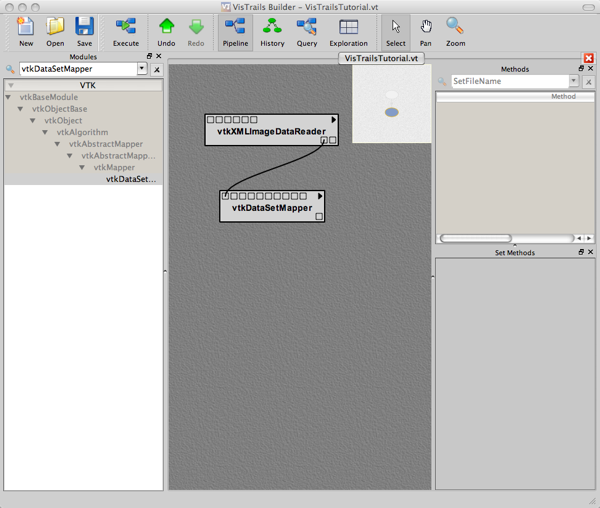
Figure 4. Adding a mapper.
The squares in the modules are called 'ports'. They represent pathways for data flowing into and out of a module. Input ports are always located at the top left of a module, and output ports are always located at the bottom right.
Before you can display the data, you need to add a few more modules. Add a vtkActor module below the vtkDataSetMapper. Connect the output port of the vtkDataSetMapper to the leftmost input port of the vtkActor. A vtkActor represents an element of your visualization. It lets you specify things like the scale, orientation, and translation of the data set, as well as certain properties of the data being displayed, such as the color of the data set outline.
A vtkRenderer module is responsible for executing the drawing commands issued by the vtkDataSetMapper. Add one to the workflow, and connect the vtkActor to it. This is a little trickier than in connecting the previous modules because you need to make sure that the output port of the vtkActor is connected to the correct input port of the vtkRenderer. Click on the output port of the vtkActor and drag a line toward the middle of the row of input ports at the top of the vtkRenderer. As you move the mouse along the row of ports, the line will snap to a valid input port. There are quite a few valid input port in this case, but we want to set the connection to 'Input port AddActor', which is fifth from the left. If you accidentally connect to the wrong port, you can select the connection by clicking on it (it will become orange) and pressing the delete key.
Finally, we need to add one more module, the VTKCell. This module is responsible for actually displaying the images rendered by the vtkRenderer in a VisTrails window. Connect the output port of the vtkRenderer to the input port of the VTKCell second from the left. When you are finished, your canvas should appear as in Figure 5.
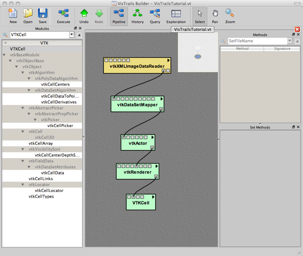
Figure 5. The complete visualization pipeline.
To test out the visualization, click the Execute button again. You should see various elements of the workflow light up as the execution proceeds. When it is finished, the VisTrails Spreadsheet window will appear with a visualization of the data set. If the spreadsheet does not automatically show up on top, find it and click on it. You can rotate the visualization by clicking and dragging the mouse within the visualization window. Holding down the shift key while doing this will translate the scene, while holding down the control key will zoom in or out of the scene. Alternately, you can use the middle and right mouse buttons to pan and zoom, respectively. You should see an image similar to Figure 6.
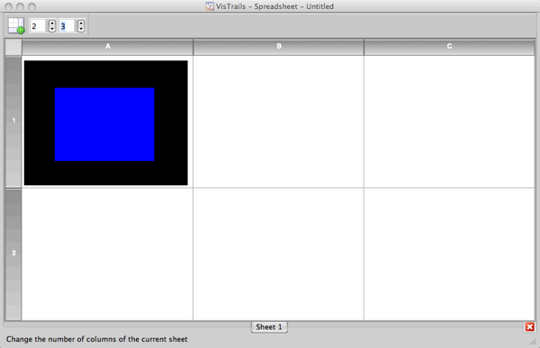
Figure 6. The spreadsheet showing the first visualization.
The spreadsheet contains cells, each of which can contain a different visualization. This spreadsheet is useful for comparing different iterations of a visualization. For now, we'll reduce the number of cells to one to concentrate on a single visualization. In the upper right corner of the window, you will see two text boxes. The one on the left controls how many rows are in the spreadsheet, and the second one controls the number of columns. Set each value to 1. Your visualization should now come close to filling the window.
Unfortunately, the visualization isn't interesting or informative: it is totally blue. To make it more interesting, we need to tell the vtkDataSetMapper how it should map the data through the default color map. This basically involves telling the mapper what data values should be mapped to the low and high ends of the color map. By default, this data range does not match the data range of the elevation data set. Change this by clicking on the vtkDataSetMapper. Look for the method SetScalarRange and drag it to the Set Methods panel. Enter 1278 in the first text box labeled Float and 3459 in the second. Click Execute again. You should now see an image similar to Figure 7 in the spreadsheet window.
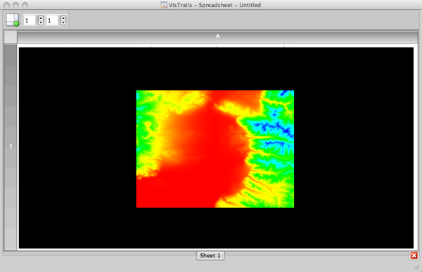
Figure 7. Color map applied to the full range of the data.
Before moving on in the tutorial, we'll tag the current workflow. This will allow you to come back to the current visualization and start a new workflow based on the current one. Go back to the Builder window. In the tool bar, click on the History button. You should see two ovals connected by a line. Click on the bottom oval so that it is outlined in orange. In the upper right of the window, find the Tag text box. Enter the name 'Default Color Map' in this field and press return. The history should now look like Figure 8. To get back to the workflow view, click on the Pipeline button in the tool bar.
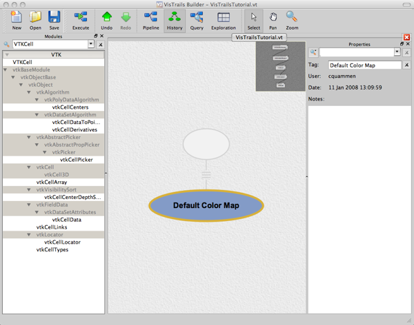
Figure 8. The tagged workflow in the history window.
Next, we will represent the elevation data as a height field. Delete the connection between the vtkXMLImageDataReader and the vtkDataSetMapper by clicking on the line so that it is highlighted in orange, and press delete. Move the vtkDataSetReader up to make enough room for two more modules. First, add a vtkDataSetSurfaceFilter below the vtkXMLImageDataReader and connect its input port to the output port of the vtkXMLImageDataReader. Next, add a vtkWarpScalar module below the module you just added. Connect its input port to the output port of the vtkDataSetSurfaceFilter and the output port of the vtkWarpScalar to the input port of the vtkDataSetMapper. Click on the vtkWarpScalar module and add the SetScaleFactor method to the value 0.1. Your workflow should now look like Figure 9.
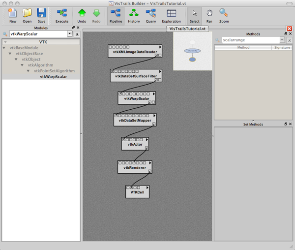
Figure 9. The workflow for the height field.
Execute the workflow. Adjust the camera viewpoint in the visualization so that it looks like Figure 10. To avoid having to adust the view every time you execute the pipeline, save this view to the pipeline by clicking Save Camera at the right side of the tool bar in the Spreadsheet window. This will add a vtkCamera module to the pipeline with the current view settings. The module will be connected to the vtkRenderer. It might be placed on top of some other modules. If this bothers you, move it to the side.
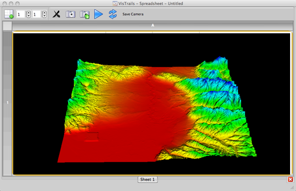
Figure 10. The height field visualization.
There are two annoying things with the visualization in Figure 10. First, the default color map in VTK is the rainbow color scale, which, as we'll see in the course, is almost always the wrong choice. Second, the default color map is reversed from how it is normally used. By convention, the blue end of the rainbow color scale represents low values while the red end represents high values; this is reversed in VTK's default color map. We'll deal with the first annoyance later, and the second one in this tutorial.
To reverse the color map, add a vtkLookupTable module near the vtkDataSetMapper module. Connect its output port to the third input port from the right on the vtkDataSetMapper (SetLookupTable). The vtkLookupTable provides a way to manipulate color maps in the rainbow family; as such, this module should typically be avoided. However, we'll work with it here to show how to change color maps. To set the ordering of the colors in the map, drag the SetHueRange method to the Set Methods panel. Set the top Float to 0.667 and the bottom Float to 0.0. Your workflow should look like Figure 11.
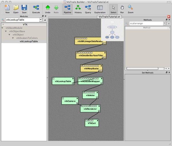
Figure 11. Workflow for reversed color map.
Execute the workflow again. The visualization will now appear as in Figure 12.

Figure 12. Reversed color map in the visualization.
Tag the current workflow, calling it 'Rainbow Color Map'.
Next, we'll add some elevation contours to the surface. Add the following three modules to the right of the current workflow: vtkContourFilter -> vtkDataSetMapper -> vtkActor ->. The "->" indicates to connect the output port of the module to the left of the arrow to the input port of the module to the right of the arrow. Connect the output of vtkWarpScalar to vtkContourFilter, and add a connection from the new vtkActor to the AddActor input port of the vtkRenderer. This new sub-workflow shows an important thing: Multiple connections can be made from a module's output port, and some modules can have multiple connections to input ports.
Set the parameters for the newly added modules as follows:
The workflow will now appear as in Figure 13. The visualization should look like Figure 14.
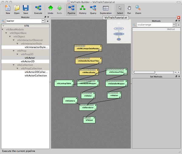
Figure 13. Workflow for generating contours.
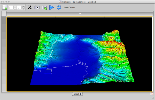
Figure 14. Visualization with contours.
The lines are very thin, light, and hard to see. We'll make them contrast with the height field better by making them black, and we'll thicken them slightly. Add a vtkProperty module, placing it to the right of the the newest vtkActor. Connect it to the second input port of the vtkActor (SetProperty). In the vtkProperty, add the method SetDiffuseColor and set the Float values to (0, 0, 0). Add the method SetLineWidth and set the Float to 2. The workflow will appear as in Figure 15, and the resulting visualization will appear as in Figure 16.
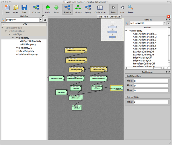
Figure 15. Workflow for thick black contour lines.
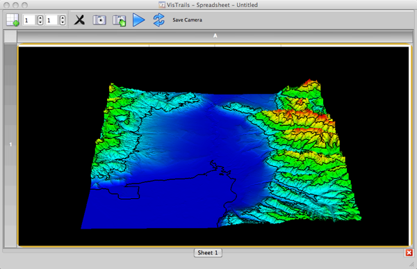
Figure 16. Visualization with thick black contour lines.
Tag the visualization with the name 'Contour Lines'.
As you develop a visualization, it will often be able to compare several versions. The Spreadsheet provides this capability. In the Spreadsheet window, increase the number of columns in by changing the value in the rightmost text box at the top of the tool bar to '3'. Go back to the Builder window and click on the History button. Click on the 'Rainbow Color Map' node and click Execute. This version of the visualization will appear in the second cell in the spreadsheet. Next, click on the 'Default Color Map' node and then click on Execute. In the Spreadsheet window, you will see the three visualizations you have tagged. The views may have different orientations, making it difficult to compare the visualizations. You can synchronize the visualizations by clicking on the skinny cell to the left of the leftmost visualization. This highlights all the cells in the spreadsheet which indicates that their views are linked. When you interact with one visualization, the view in the other cells will be the same. Your spreadsheet should look like Figure 17.
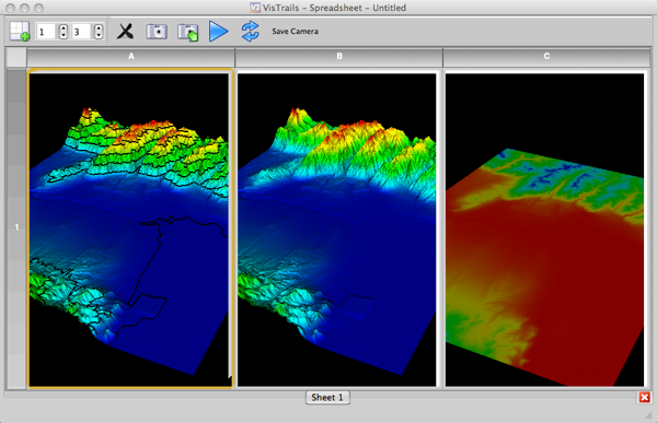
Figure 17. Comparing three visualizatons of the data.
VisTrails has an interface that allows exploration of visualization parameters. This can be helpful for finding the parameters that show interesting features in the data set, or it can be used to tweak a visualization so that it conveys the most information. Here, we will explore two parameters: the scale factor of the height field, and the number of contour lines. In the toolbar, click on History and click on the 'Contour Lines' node, then click the Exploration button.
The workflow window now shows a panel with the text Drag alias/parameters here for a parameter exploration. On the upper right side of the window, the parameters of the visualization described by the workflow are listed. Under the vtkWarpScalar entry, click on SetScaleFactor and drag it to the parameter exploration panel. Two text boxes will appear with a green arrow between them. Set the left one to 0.1 and the right one to 0.2. This means that the parameter exploration will change the height scale factor from 0.1 to 0.2. To the right of the second text box, there are a series of five circles. By default, the leftmost circle will be chosen. Above this circle, there is an icon indicating that visualizations from this parameter variation will be shown along columns in the spreadsheet. Below this icon, there is a number indicating how many parameter valuess will be shown in the spreadsheet. Change this number to 3 by clicking on the up arrow next to the number. The interface will appear as in Fgure 18. Click on Execute. The spreadsheet should now look like Figure 19.
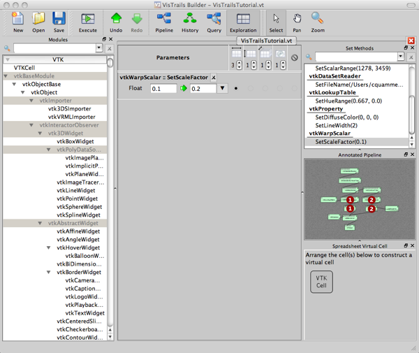
Figure 18. The exploration interface.
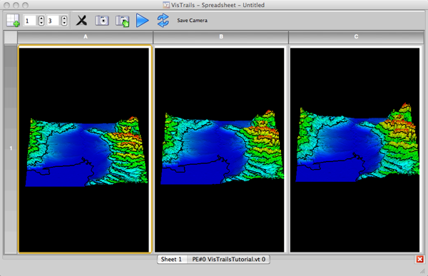
Figure 19. Exploring the scale factor of the height field.
Next, we will add another parameter to explore. Under vtkContourFilter, drag the GenerateValues method to the parameter exploration window. There are three parameters for this method. We want to vary only the first, the Integer. Disable the Float parameters by clicking on the circles under the 'No' symbol (like the no smoking symbol without the cigarette). Next, change the left text box for the Integer parameter to 3, and leave the right text box at 5.
If we leave the circle to the right of the Integer under vtkContourFilter::GenerateValues at the default setting, both parameters for the SetScaleFactor and the GenerateValues method will be varied across one row of the spreadsheet. Instead, we would like to enumerate the combinations of the parameters for these methods independently across rows and columns. To do this, click on the circle second from the right in the row containing the Integer parameter. At the top of this column, there is an icon indicating that this parameter will be varied across rows. Increase the number of rows to 2. Click Execute. The exploration interface will appear as in Figure 20, and the spreadsheet will look like Figure 21.
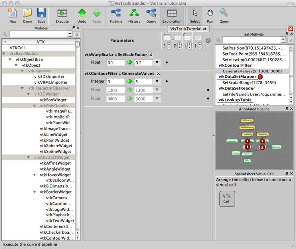
Figure 20. The exploration interface with two parameters.
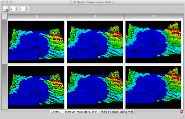
Figure 21. The spreadsheet exploring two visualization parameters: height field scale and number of contours.
In this tutorial, you will explore modifying color and opacity maps in a volume visualization.
In VisTrails, open the file visfoot.vt by choosing File->Open and navigating to where you unzipped the files for these tutorials. Click on the history node Starting Point and click on the Pipeline button in the tool bar. A pre-built visualization will appear as in Figure 22.
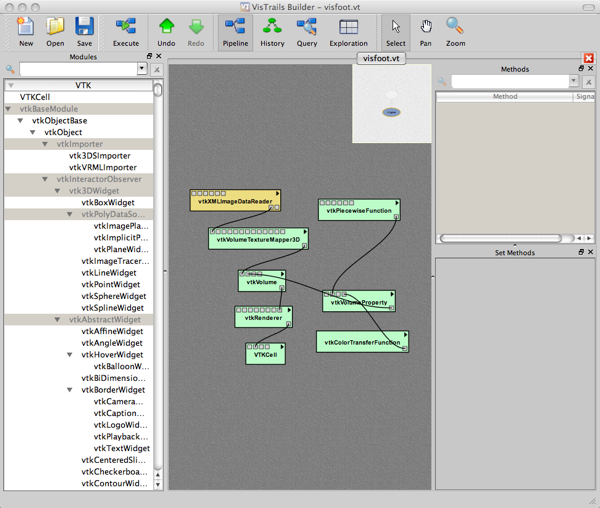
Figure 22. Pre-built volume visualization workflow.
Click on the vtkXMLImageDataReader. Notice that the SetFileName method has been set in the Set Methods panel. VisTrails does not understand relative file path names, so you will have to point it to the location on your computer where you extracted the files for this tutorial. Click on the folder icon on the right side of the String parameter, navigate to where you extracted the files, and choose visfoot.vti. Execute the workflow. You should see an image as in Figure 23 in the Spreadsheet window.
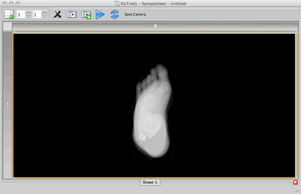
Figure 23. Volume visualization of a human foot.
This visualization allows you to see the rough shape of the foot as well as the bones. It is tough to understand the shape of the bones in any single viewpoint, so we'll add some lighting. Click on the vtkVolumeProperty module and drag the ShadeOn method down to the Set Methods panel. This method does not take any parameters. It indicates that a lighting model should be applied during volume rendering, making perception of regions of high density gradient in the volume easier. After clicking Execute, you should have an image that appears as in Figure 24.
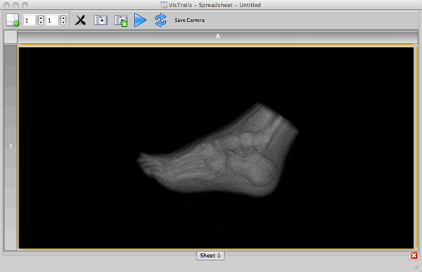
Figure 24. Gradient-based shading.
The shading makes the image darker overall. Let's brighten up the image by adjusting the opacity map so that the bones are brighter. An opacity map defines the mapping from data value to opacity value. If a data value maps to zero opacity, it will not be visible in the visualization, but if it maps to complete opacity (value 1), it will be quite visible. Data values that map to an opacity somewhere between 0 and 1 will be semi-opaque to the degree indicated by the opacity level.
In this case, we want to highlight the bone structures in the foot. For density values in the data set that correspond to bone, we will set the opacity relatively high. For other values, we will set the opacity values much lower, or even zero if we don't want to see those densities. We would still like to see the outline of the foot to maintain context, so we will set the opacity for skin values slightly above zero.
To edit the opacity map, click on the vtkPiecewiseFunction that is connected to the vtkVolumeProperty. The opacity map is defined as a piecewise-linear function. To define this function, you will set the opacity values at various points in the map. Start by modifying the two AddPoint_1 methods under the Set Methods panel so that they have these values: (0, 0.0) and (32, 0.0). Add six new instances of the AddPoint_1 method by dragging them from the Method panel to the Set Methods panel. For these six images, set the values to: (35, 0.13), (54, 0.13), (60, 0.0), (80, 0.0), (85, 0.5), and (255, 0.5). Execute the workflow again. You should see an image as in Figure 25.
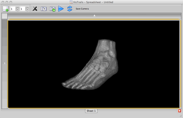
Figure 25. Highlighted bone structure.
We'll make the skin look a bit more like skin. Click on the vtkColorTransferFunction and change the first two AddRGBPoint_1 methods to have the parameters (0, 0.8, 0.52, 0.25) and (60, 0.8, 0.52, 0.25). Add two more instances of this method with the values: (65, 1, 1, 1) and (255, 1, 1, 1). After executing the workflow, the foot should now appear as in Figure 26.
Tag this version of the visualization as 'Bone and Skin'. Save the VisTrails file with your modifications.
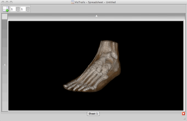
Figure 26. Highlighted bone structure.