The previous section considered methods for characterizing network-level properties of traffic that can be incorporated into traffic generators as input parameters. Here we consider other network-level properties that can be used to compare traces, providing a way to assess the realism of synthetic traffic. In order to make the distinction between these two types of network-level properties clearer, we apply the term network-level parameter to those properties that are part of the input of the traffic generation method, and the term network-level metric to those properties that are not part of the input but are still useful for characterizing the output (i.e., the synthetic traffic). The key idea, demonstrated in Chapter 6, is that synthetic traffic can closely approximate real traffic in terms of these network-level metrics, as long as source-level and network-level parameters are incorporated into the traffic generation method. The success of this approach confirms that the parameters we have incorporated in our approach are significant, and that the data acquisition methods we propose are sufficiently accurate to achieve high realism in traffic generation.
A basic property of the performance of a network link is the number of bytes and packets4.8that traverse the link per unit time. We will call this property aggregate throughput, since it is the result of multiplexing the throughputs of the individual connections that form the traffic carried by a network link. Accurately reproducing aggregate throughput will be an important part of our evaluation.
Aggregate throughput is generally very variable, so researchers
(and practitioners) usually study the time series of aggregate throughputs
in order to understand the dynamics of network traffic. Formally,
an aggregate throughput time series at scale ![]() is defined as
a vector
is defined as
a vector
![]() where
where ![]() is the number of
bytes (or packets) observed at a measurement point between time
is the number of
bytes (or packets) observed at a measurement point between time ![]() and
time
and
time ![]() for some constant interval
for some constant interval ![]() . This constant integral
. This constant integral ![]() is called the
scale of the time series.
is called the
scale of the time series.
![]() is often referred to as the i-th bin of
the time series, which is sometimes called a time series of bin counts.
is often referred to as the i-th bin of
the time series, which is sometimes called a time series of bin counts.
We consider three ways of studying aggregate throughput time series in
this dissertation. First, we make use of plots of aggregate throughput
against time, ``throughput plots'', which provide a simple yet
informative visualization of the dynamics of the traffic throughout the entire trace.
Second, we examine the marginal distribution of the time series
using a CDF, which enables us to study the fine scale characteristics of the
throughput process. These two methods are described in more detail below.
While they are useful, they are sensitive to the scale ![]() at which
the time series is analyzed (e.g., throughput per minute is much smoother
than throughput per millisecond).
For this reason, we complement our analysis with a third method, wavelet
analysis. Wavelet analysis is a multi-resolution method particularly suitable
to study how the statistical nature of
at which
the time series is analyzed (e.g., throughput per minute is much smoother
than throughput per millisecond).
For this reason, we complement our analysis with a third method, wavelet
analysis. Wavelet analysis is a multi-resolution method particularly suitable
to study how the statistical nature of ![]() changes as a function of
changes as a function of ![]() .
This type of study, often known as ``traffic scaling'', is
specially important for Internet traffic, which
exhibits strong long-range dependence. We employ both plots of the wavelet
spectrum of a throughput time series, and wavelet-based estimates of
Hurst parameters with confidence intervals.
.
This type of study, often known as ``traffic scaling'', is
specially important for Internet traffic, which
exhibits strong long-range dependence. We employ both plots of the wavelet
spectrum of a throughput time series, and wavelet-based estimates of
Hurst parameters with confidence intervals.
When it comes time to validate synthetic traffic generation methods, an important aspect of the validation will be a qualitative comparison of plots of throughput time series and plots of their marginal distributions and wavelet spectra. Here we describe the use of these visualizations to understand the nature of throughput on the links we have measured.
![\includegraphics[width=3in]{fig/netw-level-metrics/Leip-II.dst.1m.thr.eps}](img249.png)
|
![\includegraphics[width=3in]{fig/netw-level-metrics/Leip-II.dst.1m.pps.eps}](img250.png)
|
Figure 4.21 shows a breakdown of the aggregate byte throughput of the Leipzig-II trace in the inbound direction (i.e., TCP traffic coming into the University of Leipzig). The scale of the time series (the bin size) is one minute. The time series of all byte arrivals has been partitioned into six time series according to the type of abstract source-level behavior (sequential, concurrent or no payload4.9), depending on whether the start and the end of the connection were observed (fully or partially captured connections), and whether the connection was observed only in one direction of the link (unidirectional connections) or in both. The analysis of abstract source-level behavior described in Section 3.5 was used to classify connections into these categories, and then the original segment header traces were partitioned according to this classification. This type of analysis complements the one performed at the source-level in Section 3.5, giving us a sense of the relative importance of sequential and concurrent connections. Also, our traffic generation will only make use of connections that were fully captured, i.e., fully characterized, so it is important to understand the importance of the traffic in the rest of the connections (so we know what we are missing).
Figure 4.21 shows that sequential connections that were fully captured account for the vast majority of the bytes to Leipzig-II inbound. Since connections observed near the boundaries of the trace are more likely to be observed only partially, the time series shows a much smaller number of bytes in the first and in the last ten minutes of the trace. On the contrary, the time series of partially-captured sequential connections has a much larger number of bytes in the first and the last ten minutes. This is because the probability of observing only part of a connection increases as we get closer to the trace boundaries. For this reason, in the first ten minutes we see many more connections that started before the start of the trace, and in the last ten minutes we see many more connections that ended after the end of the trace. We will refer to this increased likelihood of finding partially-captured connections near trace boundaries as the connection sampling bias.
The solid line with white squares in Figure 4.21 shows the time series of fully-captured sequential connection. When we examine the stable region of this time series (i.e., ignoring the first and last 10 minutes), we can see substantial variability between the minimum of 22 Mbps and the maximum of 38 Mbps. The rest of the time series in this plot are far less ``bursty''. The average throughput of the time series for concurrent connections is much smaller, and partially-captured connections only account for a tiny fraction of the bytes. The number of bytes in connections without any useful data payload is insignificant, as one would expect in a properly working network in which little malicious activity is taking place4.10.
Figure 4.22 shows the time series of packet arrivals for the inbound direction of the Leipzig-II trace. As in the previous figure, fully-captured sequential connections account for the majority of the packets, and the time series exhibits substantial variability. Notice however that the number of packets in fully-captured concurrent connections is more significant in terms of packets than in terms of bytes (the percentage of packets was higher than the percentage of bytes). The time series of the number of packets in ``no payload'' connections and in unidirectional connections is also more significant. Notice the large spikes at the end of the time series of unidirectional connections. These spikes could be related to some malicious activity, like network or port scanning4.11, or connection attempts to a popular server that is temporarily offline4.12. This feature was not present in the corresponding time series of byte arrivals.
![\includegraphics[width=3in]{fig/netw-level-metrics/Leip-II.src.1m.thr.eps}](img251.png)
|
![\includegraphics[width=3in]{fig/netw-level-metrics/Leip-II.src.1m.pps.eps}](img252.png)
|
The same time series for the reverse direction of the Leipzig link are shown in Figures 4.23 and 4.24. The magnitude of the throughput time series is significantly smaller in this case, suggesting that the University of Leipzig is mostly a consumer of content from the rest of the Internet. Sequential connections that were fully captured exhibit some sharp spikes in three short time intervals. A closer look revealed that only a few large connections with small round-trip times (in particular, three connections in the first spike in minute 78) created this sudden increase in throughput. As in the inbound direction, partially-captured sequential connections are only significant for the first and the last few minutes of the trace. Concurrent connections also show the same pattern, but partially-captured connections exhibit a steady increase for the last 50 minutes of the trace. Interestingly, the separation between the time series for fully and partially captured sequential connections is much larger for packets than for bytes. This suggests that the packets in this direction are very small, and mostly consist of acknowledgment segments that do not have a payload. This is another confirmation of the content-consumer nature of the university of Leipzig.
![\includegraphics[width=3in]{fig/netw-level-metrics/Leip-II.src.5s.thr.eps}](img253.png)
|
![\includegraphics[width=3in]{fig/netw-level-metrics/Leip-II.src.5s.pps.eps}](img254.png)
|
Figures 4.25 and 4.26 illustrate the impact of scale on the throughput time series for the Leipzig-II outbound trace. These plots have a scale of 5 seconds, and only the first 60 minutes (rather than entire 166 minutes) are shown to reduce the amount of over-plotting. Both byte and packet throughputs are clearly more bursty at this scale. The largest spikes of time series for fully-captured sequential connections are even larger (and therefore narrower) than those in the 1-minute time series. For example, the spike in the eleventh minute reaches 17 Mbps in the 5-second scale, while the corresponding region in the 1-minute scale plot in Figure 4.23 did not go above 9 Mbps. Decreasing the scale provides a better picture of the burstiness of traffic, but it increases over-plotting, and does not change the overall view (i.e., the relative magnitude of the different time series). The same lesson holds for packet arrivals, but notice that the largest byte throughput spikes do not appear to have corresponding packet throughput spikes. This shows that a relatively small number of full packets sent in short periods created the observed throughput spikes (and not a large number of small packets).
![\includegraphics[width=3in]{fig/netw-level-metrics/IPLS-CLEV.src.1m.thr.eps}](img255.png)
|
![\includegraphics[width=3in]{fig/netw-level-metrics/IPLS-CLEV.src.1m.pps.eps}](img256.png)
|
The structure of the throughput time series for the Abilene-I trace is remarkably different. Figure 4.27 shows the time series of byte arrivals at a 1-minute scale for the Abilene-I traffic sent from Indianapolis to Cleveland. As in the Leipzig-II case, fully-captured sequential connections account for the largest percentage of the traffic. However, bytes from partially-captured sequential connections are much more significant here, with a mean throughput that is roughly half of the mean throughput for fully-captured sequential connections. While we still observe much larger throughputs in the first and last few minutes of the time series, the middle part still accounts for a very large number of bytes. This is in sharp contrast to the Leipzig-II trace, and cannot be explained by the duration of the trace, which is almost as long (2 hours vs. 2 hours and 46 minutes). Note also that the partially-captured connection time series is almost as bursty as the time series for fully-captured connections.
Concurrent connections in this direction of the Abilene-I trace show a surprising structure. The number of bytes in concurrent connections that were partially-captured was much larger than the number of bytes in connections that were fully-captured. This suggests that concurrent connections in this trace tend to have extremely long durations. Both time series are much smoother than those for sequential connections, and trace boundaries have very little impact on them. Connections with no payload carried an insignificant number of bytes, but, unlike the Leipzig-II trace, unidirectional traffic is non-negligible. Rather than some malfunction or malicious activity, this is explained by asymmetric routing in the Abilene backbone. Only one direction of these connections goes through the measured link, and hence these connections appear in our trace as unidirectional. We also observe two major throughput spikes at the 6th and the 38th minutes that could also be explained by transient routing changes, but malicious traffic cannot be ruled out without further analysis. Both spikes reach throughputs as high as 350 Mbps when the time series is examined at the 5-second scale.
The packet throughput time series for the Abilene-I trace shown in Figure 4.28 has a similar structure, in which partially-captured connections also account for a large percentage of the trace. It is interesting to note that fully-captured concurrent connections carry a larger percentage of packets than bytes, so packets in these connections are likely to be small. We also observe a third spike in the time series for unidirectional connections that did not show up in the byte throughput time series, and a smaller spike in the ``no payload'' time series.
![\includegraphics[width=3in]{fig/netw-level-metrics/IPLS-CLEV.dst.1m.thr.eps}](img257.png)
|
![\includegraphics[width=3in]{fig/netw-level-metrics/IPLS-CLEV.dst.1m.pps.eps}](img258.png)
|
The reverse direction, Cleveland to Indianapolis, of the Abilene-I trace offers a rather different view in Figure 4.29. Partially-captured sequential connections are much less significant in this case, although this time series still exhibits remarkable variability. Similarly, the number of bytes in partially-captured concurrent connections is much lower in relative terms, and quite close to the number of bytes in fully-captured concurrent connections. The most striking feature of this plot is the time series of unidirectional connections. The byte throughput of these connections shows enormous variability, and even reaches the magnitude of fully-captured sequential connections. This is either a strong indication of substantial instability in the routing of the Abilene backbone, or the existence of flows with extremely high throughput that only show up in one direction of the measured link. In any case, byte throughput is always above 50 Mbps, so part of the traffic that is routed asymmetrically did not experience any major routing changes.
The packet throughput time series from Cleveland to Indianapolis shown in Figure 4.30 offer yet another pattern in the breakdown of traffic per connection type. The sharp changes in the throughput of the time series of unidirectional traffic have a smaller magnitude, suggesting that large packets dominate traffic in this direction of the Abilene-I trace. Partially-captured concurrent connections carried significantly more packets than fully-captured connections. This is the opposite of the phenomenon in Figure 4.28 and can be explained by an asymmetry in the sizes of the ADUs of the connections. This asymmetry results from connections with a majority of data segments in the same direction and a majority of acknowledgments in the other direction.
![\includegraphics[width=3in]{fig/netw-level-metrics/unc04-aug3-1pm.dst.5s.thr.eps}](img259.png)
|
![\includegraphics[width=3in]{fig/netw-level-metrics/unc04-aug3-1pm.dst.5s.pps.eps}](img260.png)
|
The byte throughput time series for the UNC 1 PM trace in the inbound direction resembles that of Leipzig-II (which is also an edge trace). Figure 4.31 shows that fully-captured sequential connections carry the vast majority of the bytes, although the relative percentage of bytes in partially captured connections is larger. This is can be explained by the shorter duration of this trace (1 hour). The most significant difference, however, is in the time series for partially-captured concurrent connections. In this case, we find a very stable throughput of 20 Mbps without any clear boundary effects. This is similar to the type of concurrent traffic found in Abilene-I. Fully-captured concurrent connections show an interesting jump between the 37th and the 39th minutes, and a couple of spikes around the 45th minute. This could be explained by a single connection with significant throughput (10 Mbps). Packet throughput time series are similar, but we observe a significantly higher percentage of packets in partially-captured sequential connections. As the analysis of the other direction will suggest, this is due to the presence of many pure acknowledgment segments.
![\includegraphics[width=3in]{fig/netw-level-metrics/unc04-aug3-1pm.src.5s.thr.eps}](img261.png)
|
![\includegraphics[width=3in]{fig/netw-level-metrics/unc04-aug3-1pm.src.5s.pps.eps}](img262.png)
|
The byte throughput time series for the outbound direction of UNC 1 PM are shown in Figure 4.33. They are remarkably different from those of the Leipzig-II trace, where throughput on the inbound direction (created by local users downloading content from the Internet) was much higher than the throughput in the outbound direction. We observe the opposite here. The mean overall utilization in the outbound direction is much higher than the inbound direction, 325 Mbps versus 100 Mbps. Also, partially-captured sequential connections are much more significant. The obvious explanation is the presence at UNC of ibiblio.org, a popular repository of software and other content. Hosts outside UNC retrieve large amounts of data from the ibiblio.org servers, making the load in the outbound direction of the UNC link much higher than the load on the inbound link. Furthermore, ibiblio.org clients often download large objects, and this requires long connections that are more likely to be only partially captured. This provides a good explanation for the extreme boundary effects in the first and last 10 minutes of the throughput time series. The high throughput in the stable region of this time series could be due to long connections that carry large amounts of data, although further analysis is needed to verify this claim.
Concurrent traffic in the outbound direction appears similar to the inbound direction, showing remarkable load symmetry for partially-captured concurrent connections. We do not observe much variation in the time series for packet throughput (shown in Figure 4.34). Partially-captured sequential connections carried a smaller number of packets than bytes, and this agrees with the idea that large numbers of bytes are downloaded from ibiblio.org. These downloads show up as large data packets in the outbound direction and small acknowledgment packets in the inbound direction. In the most common case, a full TCP segment has a size of 1500 bytes, while an empty one (no payload) is only 40 bytes. This means that the ratio of bytes in a connection carrying a large file is 1500:40. Furthermore, since most TCP implementations acknowledge only every other data segment, we have a ratio of 3000:40 for bytes and a ratio of 2:1 for packets. A link that is dominated by large file downloads should show similar byte and packet ratios. If large file downloads from ibiblio.org were the only cause of the large fraction of bytes in partially captured connection, then we would expect similar ratios between the two directions of the UNC link. However, this is not so clear in Figures 4.31 to 4.34, suggesting that phenomena other than ibiblio.org also contribute to making UNC a source rather than a sink of content. As an example, file-sharing activity from campus dorms could also play a significant role. Since file-sharing implies both uploading and downloading, it usually tends to make the byte and packet ratios more balanced.
![\includegraphics[width=3in]{fig/netw-level-metrics/unc.5s.thr.eps}](img263.png)
|
![\includegraphics[width=3in]{fig/netw-level-metrics/unc.5s.pps.eps}](img264.png)
|
Network activity usually follows a cyclic daily pattern, in which traffic increases throughout the morning and decreases in the evening, being at its lowest during night hours. This diurnal pattern in the time series for the UNC traces is evident in Figures 4.35 and 4.36. These time series correspond to fully-captured sequential connections. Byte throughputs for the 1 PM traces are much higher in both directions and we observe that even the 1 AM trace has a large throughput in the outbound direction. This suggests that content from UNC is downloaded throughout the day, although a diurnal pattern is still present. On the contrary, UNC clients are much less active later in the day. A similar plot (not shown) for partially-captured concurrent connections shows little reduction in throughput between the 1 PM and the 7:30 PM traces, and a reduction of only 15 Mbps in the 1 AM trace. The packet throughput time series illustrate again the dichotomy between the large data segments in the outbound direction, carrying UNC content, and the small segments in the inbound direction, carrying acknowledgments. The difference is substantially less significant later in the day.
Plots of throughput time series provide a good overview of the coarse-scale characteristics of the traffic trace. However, they are not very practical for studying finer-scale features. Our traces are long enough that any plot at a scale of 1 second or below is dominated by over-plotting, and does not provide any useful information. This is specially true when the goal of the plot is to compare two time series that are already rather similar. Finer-scale differences can be of great importance for certain experiments. For example, two traces could have exactly the same average throughput, and appear identical at the 1-minute scale, but be completely different at the 1-second scale. One of them could show a sequence of sharp spikes and ditches, while the other one could remain completely smooth. If we were to expose a router queue to these two traces, we could obtain two completely different distributions of router queue length (and therefore of packet delay through the router). This would for example be the case if the spikes exceed the output rate of the queue (creating a backlog), while the smooth trace always remains below output rate. In the first case, packets would experience variable queuing delay, while in the second case no queuing delay would occur.
|
There are several ways in which we can compare traces at finer time scales. The most obvious one is to examine throughput for a limited period. While this approach is useful in some situations, it does not scale for comparing entire traces, especially as we decrease the scale and the number of possible periods to examine grows. In this dissertation, we will make use of two alternative methods for studying the throughput of our traces at finer granularities. Our first method is to examine the marginal distributions of throughput time series at a rather fine time scale, 10 milliseconds. Plots of the bodies of marginal distributions help us to understand the most common fine-scale throughputs in a trace, while plots of the tails of marginal distributions explore the episodes of highest throughput in a trace. We describe this type of analysis in the rest of this section. Our second method is to study the way throughput variance changes with scale, which we will approach using the concepts of self-similarity and long-range dependence. We discuss this type of analysis in the next section.
|
Our analysis of throughput marginals examines the time series of throughput at the 10-millisecond time-scale, constructing the empirical distribution of the values of the time series. This empirical distribution assigns a certain probability to each observed value of the time series equal to the fraction that this value represents of the total set of values in the time series. As in previous cases, we will study the bodies of the marginal distributions using plots of CDFs and the tails using plots of CCDFs. For example, Figures 4.37 and 4.38 show respectively the marginal distribution of byte and packet throughput for the inbound direction of the Leipzig-II trace (depicted using solid lines marked by white squares). The CDF in the left plot provides a good overview of the body of the marginal distribution using linear axes. The CCDF in the right plot shows the tail of the distribution using a logarithmic y-axis. These visualizations of the marginals are particularly useful for comparing multiple distributions, and we will use them extensively in Chapter 6.
|
As stated before, our goal with the analysis of marginal distributions is to understand fine-scale characteristics of throughput. We will use this type of analysis to determine whether our proposed traffic generation method results in synthetic traffic whose distribution of fine-scale throughputs is ``realistic''. By construction, and as explained in Chapter 5, the determination of this realism is accomplished by directly comparing the marginal distributions of an original trace and its synthetic version. This non-parametric analysis is consistent with other methods used in this dissertation.
We have also considered doing some parametric analysis of the marginal distributions of throughput time series. When modeling an arrival process, the first approach that comes to mind is the Poisson modeling framework. Poisson arrivals are very convenient from an analytical perspective, and concisely describe an arrival process using a single parameter. As pointed out by Floyd and Paxson [PF95], empirical studies do not support the use of this model, primarily because Poisson arrivals are far less ``bursty'' than Internet packet and byte arrivals. This important issue is discussed in the next section. In addition, we show here that Poisson arrivals have marginal distributions that are very far from the ones in our traces.
|
Given a throughput time series, we can fit a Poisson arrival model simply by computing the mean of the time series and using it as the rate of the Poisson model. From this fitted model, we can easily obtain a marginal distribution using Monte Carlo simulation. Figure 4.37 shows the marginal distribution of byte throughput in the inbound direction of the Leipzig-II trace, and the marginal distribution of the Poisson fit of this throughput process (depicted using a dashed line with white triangles). Both marginal distributions have the same mean, 39.24 Kilobytes per 10-millisecond interval. As shown in the figure, the two marginals are very different, with the Poisson fit exhibiting a far narrower body. The standard deviation of the Poisson model is only 6.25, while the one for the real marginal distribution is 15.13, more than twice as large. In addition, the tail of the marginal distribution from Poisson arrivals is far lighter than the one from the trace. Intuitively, this means that the real traffic is far more aggressive on the network, consistently reaching far higher throughput values. Poisson arrivals are equally inadequate for modeling packet arrivals, at least in terms of their marginal distributions, as shown in Figure 4.38. Figures 4.39 and 4.40 repeat the same analysis for the outbound direction of UNC 1 PM. The plots confirm the poor fit from the Poisson arrival model, even for a trace with a throughput that is eight times higher. The same is true for every other trace examined in this dissertation.
The empirical results in Fraleigh et al. [FTD03] and the analysis in Appenzeller et al. [AKM04] support the idea that throughput values are normally distributed in Internet traffic, as long as sufficient traffic aggregation exists. If this were true, studying (and comparing) marginal distributions of throughput could easily be accomplished by looking at means and variances. Our analysis of the throughput marginals in our traces shows that they do resemble a normal distribution, but that this model is not completely satisfactory.
|
|
We can easily fit a normal model to the marginal distributions from our traces by computing their means and standard deviations. Figures 4.37, 4.38, 4.39 and 4.40 compare the real marginals and their fits, consistently showing the following two differences:
The deviation from normality of the empirical marginal distributions is statistically significant. First, every marginal distribution from the traces fails the Kolmogorov-Smirnov test of normality [NIS06]. Second, every plot [NIS06] shows a clear departure from normality. This is true not only for the 10-millisecond time-scale, but also for the 100-millisecond, the 1-second time series, and even for the 10-second time series in some cases. We illustrate this type of analysis again using the throughput marginals of Leipzig-II inbound and UNC 1 PM outbound. The plots in Figures 4.41 and 4.42 show Q-Q plots for different time-scales, where the quantiles of the data and the theoretical normal distribution are compared using a thick line with white dots. If the data were normally distributed, the Q-Q line would closely follow the the dashed 45 degree line. This is clearly not the case, but the Q-Q plot does not provide any sense of statistical significance. To address this deficiency, the plots also show simulation envelopes, depicted using thin, dark-gray lines, following the methodology in Hernández-Campos et al. [HCMSS04]. They are easiest to see in the 10-second time series, the ones with the least over-plotting. Each line in the envelope corresponds to a distribution constructed by sampling the theoretical normal distribution as many times as values were present in the empirical marginal distribution. The envelope therefore captures the natural variability of the normal distribution for the given sample size. If the Q-Q line comparing the empirical marginal and the theoretical normal distribution is outside this envelope, the deviation from normality is considered statistically significant. This is clearly the case for every marginal distribution in the plots, except the ones at the 10-second scale of Leipzig-II inbound.
The plots in Figures 4.41 and 4.42
also show the results of the , a formal test of normality.
The third line in the inside legend, below the sample mean ![]() and the standard deviation
and the standard deviation
![]() , shows the result of the formal test.
The null hypothesis (non-normality) can only be rejected for the marginals of the
Leipzig-II throughput at the 10-second time-scale. The plots show a
, shows the result of the formal test.
The null hypothesis (non-normality) can only be rejected for the marginals of the
Leipzig-II throughput at the 10-second time-scale. The plots show a ![]() when the
null hypothesis can be rejected, and a
when the
null hypothesis can be rejected, and a ![]() when it cannot be rejected.
Given these results, assuming normality to study the marginals of our traces
(and those of their synthetic versions) is of dubious value. We will restrict
ourselves to comparative plots of CDFs and CCDFs for comparing throughput marginals.
when it cannot be rejected.
Given these results, assuming normality to study the marginals of our traces
(and those of their synthetic versions) is of dubious value. We will restrict
ourselves to comparative plots of CDFs and CCDFs for comparing throughput marginals.
Note that we are not arguing that our finding of pervasive deviations from normality invalidates earlier studies based on the assumption of normality in throughput marginals. From our analysis, the bodies of the marginals are close enough to the normal distribution that assuming normality can provide a useful simplification. As long as significant deviations from normality in the tails have little or no effect on the reasoning, assuming normality makes analytical studies more treatable and even more intuitive.
Our finding of non-normality in our traces is consistent with the observation by Sarvotham et al. [SRB01]. These authors demonstrated that deviations of the throughput marginal from normality can be explained by the presence of an alpha component in Internet traffic. Alpha traffic is composed of connection with high throughputs that transfer large amounts of data. In contrast, connections with moderate or low throughputs and connections with moderate or small amounts of data to transfer are considered beta traffic, whose throughput marginal is normally distributed. Intuitively, a traffic generation method should be able to reproduce both the alpha and the beta components of Internet traffic. Sarvotham et al. also proposed to consider traffic bursty when its throughput marginal deviates from normality. This is an alternative (and complementary) view of traffic burstiness, which is more commonly associated with long-range dependence in the arrival process, as we will discuss next.
A remarkable characteristic of Internet traffic is its high variability in throughput across a wide range of time scales, and how that variability changes as scale increases. If we plot the number of packets or bytes that arrive at a network link, say every 1 or 10 milliseconds, we observe a highly variable process where the number of arrivals is constantly changing. If we plot these arrivals at a coarser scale, say every 100 milliseconds or 1 second, this high variability does not decrease significantly. In contrast, Poisson arrivals exhibit a rapid decrease in variability as we increase the scale of the time series. For this reason, it is often said that Internet traffic has a ``very bursty'' arrival process, far more variable than that of call arrivals in a phone network. Starting with the work of Leland et al. [LTWW93], traffic burstiness has usually been characterized using the theoretical framework of statistically self-similar processes. This framework provides some powerful methods to study traffic burstiness and quantify its strength.
The motivation behind the study of traffic burstiness is the observation that an increase in the burstiness of traffic results in a more demanding network workload. For example, Erramilli et al. [ENW96] demonstrated that router queues exhibit dramatically heavier distributions of queue lengths as the burstiness of the input packet arrival process increases. Numerous measurement studies, e.g., [WTSW97,ZRMD03,PHCMS05,PHCL$^+$], have examined Internet traffic and consistently observed highly bursty arrivals that appear self-similar for scales between a few milliseconds and tens of seconds. It is therefore expected that representative synthetic traffic reproduces this high burstiness. In this dissertation, we employ well-known methods to assess the self-similarity of real and synthetic traffic, and verify that our traffic generation methods can reproduce the level of burstiness in Internet traffic.
The term self-similarity comes from the study of fractal objects. Fractals are geometrical constructs that appear similar a different scales. The most famous example of fractal is the Mandelbrot set, whose cardioid shape repeats itself as we zoom into the set. In this fashion, a second-order self-similar time series shows a similar pattern of variation at different time-scales. For this reason, self-similarity is also known as scale-invariance. Some authors talk about ``traffic scaling'' or simply ``scaling'' to refer to the observed self-similarity in network traffic.
Quantitatively, the change in the arrival variance for a self-similar time series
of bin counts ![]() is proportional to
is proportional to ![]() , where
, where ![]() represents
scale as the aggregation of arrival counts, and
represents
scale as the aggregation of arrival counts, and ![]() is known as the Hurst parameter.
For example, the variance in bin counts in a Poisson process is proportional to
is known as the Hurst parameter.
For example, the variance in bin counts in a Poisson process is proportional to
![]() . That is, a Poisson arrival process has
. That is, a Poisson arrival process has ![]() .
A stationary, long-range dependent process has
.
A stationary, long-range dependent process has ![]() .
The closer the value of the Hurst parameter is to 1, the slower the variance
decays as scale (
.
The closer the value of the Hurst parameter is to 1, the slower the variance
decays as scale (![]() ) increases, and the traffic is said to be increasingly more
bursty (than Poisson arrivals).
The slow decay of the arrival variance in self-similar traffic, as scale increases,
is in sharp contrast to the mathematical framework provided by Poisson modeling,
in which the variance of the arrivals process decays as the square root of the scale
(see [LTWW93,PF95]).
This quantitative characterization of self-similarity provides us with the right
framework to compare real and synthetic traffic, assessing the validity of the
traffic generation process in terms of the burstiness of the packet/byte arrival
process.
) increases, and the traffic is said to be increasingly more
bursty (than Poisson arrivals).
The slow decay of the arrival variance in self-similar traffic, as scale increases,
is in sharp contrast to the mathematical framework provided by Poisson modeling,
in which the variance of the arrivals process decays as the square root of the scale
(see [LTWW93,PF95]).
This quantitative characterization of self-similarity provides us with the right
framework to compare real and synthetic traffic, assessing the validity of the
traffic generation process in terms of the burstiness of the packet/byte arrival
process.
Self-similarity also manifests itself as Long-Range Dependence4.13 (LRD)
in the time series of arrivals. This means that there are non-negligible
correlations between the arrival counts in bins that are far apart.
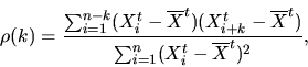
A common way of studying these correlations is to compute the autocorrelation ![]() of a
time series, where
of a
time series, where ![]() is the autocorrelation lag. The autocorrelation
at lag k,
is the autocorrelation lag. The autocorrelation
at lag k,
The concepts and definitions of self-similarity and LRD assume that the time series of arrivals is second-order stationary (also called weakly stationary). Loosely speaking, this means that the variance of the time series (and more generally, its covariance structure) does not change over time, and that its mean is constant (so the time series can always be transformed into a zero-mean stochastic process by simply subtracting the mean). The intuitive interpretation of this concept is that the time series should not experience any major change in variance, which would be associated with a fundamental change in the nature of the studied process. For example, a link usually used by 1,000 hosts that suddenly becomes used by 10,000 hosts (e.g., due to a ``flash crowd'') would show a massive throughput increase, and much higher variance, which would make it non-stationary. These types of major changes are outside the scope of LRD analysis. They represent a coarse-scale feature of the time series which should be studied using other methods (e.g., trend analysis using SiZer [CM99]).
Traffic is certainly not second-order stationary at the scales at which time-of-day effects are important. For example, a 24-hour trace is usually non-stationary due to the sharp decrease in network utilization at night. The number of sources at night is far smaller, which decreases variance, violating the second-order stationarity assumption. Trying to estimate the Hurst parameter of a 24-hour trace that exhibits a time-of-day effect results in a meaningless number. In our traffic generation work, we will estimate Hurst parameters (and other measures of self-similarity) for traces that are second-order stationary. Our traces have moderate durations, between 1 and 4 hours, which greatly diminishes the impact of time-of-day variations. We also carefully examined the packet and byte arrival time series of our traces and found no evidence of sharp changes that could be associated with second-order non-stationary.
Estimation of Hurst parameters is not a trivial exercise.
Besides ensuring that no significant second-order non-stationarity is present
in the data, common estimation methods are very sensitive to outliers and
trends in the data, as pointed out by Park et al. [PHCL$^+$].
These difficulties motivate some preprocessing of the studied time series
(e.g., detrending) or to employ robust methods.
In this dissertation, we will make use of wavelet analysis to study the
scaling properties of real and synthetic traffic. We will follow the analysis method
of Abry and Veitch [AV98] and make use of their Matlab implementation
of the method.
In general, we will compute what is called the wavelet spectrum of the time series of
packet and byte counts in 10 millisecond intervals. This is also referred to as
the logscale diagram in some works4.14.
The wavelet spectrum provides a visualization of the scale-dependent
variability in the data (see Figure 4.43
for an example).
Briefly, a logscale diagram plots the
logarithm of the (estimated) variance of the Daubechies wavelet coefficients, the energy, as
a function of the logarithm of the scale ![]() ,
where
,
where ![]() is the time scale and
is the time scale and ![]() is known as
the octave. The Daubechies wavelet coefficients come from a decomposition of
the time series in terms of the Daubechies wavelet basis, which is a collection of
shifted and dilated versions of a mother Daubechies wavelet (a function) [Wal99].
Intuitively, this decomposition is similar to the Fourier transform,
which decomposes a time series in terms of sinusoidal functions.
The wavelet transform also performs a decomposition but it uses a compact support,
so it can represent localized features (sinusoidal functions have infinite support).
Besides this property, the benefit of the wavelet transform is its robustness to trends
in the data, which can easily confuse other types of analysis, such as the variance-time
plot [LTWW93]. Wavelet analysis is robust to moderate non-stationarities.
is known as
the octave. The Daubechies wavelet coefficients come from a decomposition of
the time series in terms of the Daubechies wavelet basis, which is a collection of
shifted and dilated versions of a mother Daubechies wavelet (a function) [Wal99].
Intuitively, this decomposition is similar to the Fourier transform,
which decomposes a time series in terms of sinusoidal functions.
The wavelet transform also performs a decomposition but it uses a compact support,
so it can represent localized features (sinusoidal functions have infinite support).
Besides this property, the benefit of the wavelet transform is its robustness to trends
in the data, which can easily confuse other types of analysis, such as the variance-time
plot [LTWW93]. Wavelet analysis is robust to moderate non-stationarities.
For processes that are long-range dependent, the
wavelet spectrum exhibits an approximately
linear relationship with a positive slope between energy and octave. For Internet
traffic, the region where this linear scale relationship begins is generally on the order of
a few hundred milliseconds (4th to 6th octave for 10-milliseconds time series). An estimate
of the Hurst parameter ![]() along with a
confidence interval on the estimate can be obtained from the slope of the wavelet spectrum,
along with a
confidence interval on the estimate can be obtained from the slope of the wavelet spectrum,
![]() . See the book edited by Park and Willinger
[PW00]
for a more complete overview of long-range dependence in network traffic,
and papers by Veitch et al. [AV98,HVA02] and
Feldmann et al. [FGHW99,Fel00]
for more detail on traffic analysis using wavelets.
. See the book edited by Park and Willinger
[PW00]
for a more complete overview of long-range dependence in network traffic,
and papers by Veitch et al. [AV98,HVA02] and
Feldmann et al. [FGHW99,Fel00]
for more detail on traffic analysis using wavelets.
![\includegraphics[width=3in]{fig/netw-level-metrics/Leip-II.seq-full.dst.poisson.lrd_pkts.eps}](img296.png)
|
![\includegraphics[width=3in]{fig/netw-level-metrics/Leip-II.seq-full.dst.poisson.lrd_bytes.eps}](img297.png)
|
Figure 4.43
shows the wavelet spectra of the time series
of packet throughputs for fully-captured sequential connections in the Leipzig-I trace.
As explained in Section 4.2.1, this type of connection is responsible for the
overall burstiness of the traffic in our trace4.15.
For comparison, Figure 4.43 also plots
a simulated time series of Poisson arrivals with the same mean (38.94 packets per
10-millisecond bin4.16).
Note that only the middle 150 minutes of the Leipzig time series were used, eliminating
the non-stationarity created by the boundaries of the trace.
The plot shows the variance of the wavelet coefficient (or energy) as a function of the
octave. The first octave comes from the dyadic aggregation of 10-milliseconds bins, so
it represents the energy at the 20-millisecond scale. The second octave comes from the dyadic
aggregation of the bins aggregated in the previous octave, so it represents the energy at the
40-millisecond scale. The same dyadic aggregation is used for every successive scale,
so octave 12 represents the energy at the 10 milliseconds times ![]() scale, i.e., at the
40.96-second bins. To make the plot more readable, we added labels on top of the plot
with the scale given in seconds.
Due to the nature of the wavelet basis, the exponential decay of the autocorrelation in
a short-range dependent process results in a
wavelet spectrum with a slope of zero. On the contrary, the decay in a long-range dependent process is slower than exponential,
and results in a wavelet spectrum with a positive slope. The wavelet spectrum of Leipzig-II has a positive slope that indicates long-range dependence,
while the synthetic Poisson time series does not show such a trend (it is short-range
dependent).
Note also that the height of the curves is rather different. This is
because the overall variance of the Poisson arrivals is smaller. The standard
deviation of the aggregate packet throughput time series was 12.96 while that of
the synthetic Poisson arrivals was 6.23.
The estimated Hurst parameters were 0.940 (with confidence interval [0.931,0.949])
for the Leipzig-II trace and 0.496 (with confidence interval [0.487, 0.505])
for the synthetic Poisson arrivals.
scale, i.e., at the
40.96-second bins. To make the plot more readable, we added labels on top of the plot
with the scale given in seconds.
Due to the nature of the wavelet basis, the exponential decay of the autocorrelation in
a short-range dependent process results in a
wavelet spectrum with a slope of zero. On the contrary, the decay in a long-range dependent process is slower than exponential,
and results in a wavelet spectrum with a positive slope. The wavelet spectrum of Leipzig-II has a positive slope that indicates long-range dependence,
while the synthetic Poisson time series does not show such a trend (it is short-range
dependent).
Note also that the height of the curves is rather different. This is
because the overall variance of the Poisson arrivals is smaller. The standard
deviation of the aggregate packet throughput time series was 12.96 while that of
the synthetic Poisson arrivals was 6.23.
The estimated Hurst parameters were 0.940 (with confidence interval [0.931,0.949])
for the Leipzig-II trace and 0.496 (with confidence interval [0.487, 0.505])
for the synthetic Poisson arrivals.
![\includegraphics[width=3in]{fig/netw-level-metrics/Abilene-I.seq-full.lrd_pkts.eps}](img299.png)
|
![\includegraphics[width=3in]{fig/netw-level-metrics/Abilene-I.seq-full.lrd_bytes.eps}](img300.png)
|
The same qualitative results hold for byte arrivals, as illustrated in Figure 4.44. Here the mean number of bytes per 10-millisecond bin for Leipzig was 34,400, and the standard deviation of the trace was 14,000, while the standard deviation of the synthetic Poisson arrivals was only 188. The estimated Hurst parameters were 0.941 (with confidence interval [0.932,0.950]) for Leipzig-II and 0.496 (with confidence interval [0.487, 0.505]) for the synthetic Poisson arrivals.
Figure 4.45 shows the wavelet spectrum of the packet throughput time series for Abilene-I (in the two directions: Indianapolis to Cleveland and Cleveland to Indianapolis). While the overall impression is similar to that of the previous figures, we find a change in slope after the 11th octave. Note that both directions exhibit similar long-range dependence. The estimated Hurst parameters were quite high: 1.016 (confidence interval [1.005, 1.027]) for the Indianapolis to Cleveland trace, and 1.009 (confidence interval [0.998, 1.019]) for the opposite direction. Byte throughput for the same trace shown in Figure 4.46 is qualitatively similar. The estimated Hurst parameters were 1.169 (confidence interval [1.158, 1.180]) and 1.046 (confidence interval [1.035, 1.057]). Both are significantly above 1, so some non-stationarity is present in the trace.
![\includegraphics[width=3in]{fig/netw-level-metrics/unc04-aug3-1pm.seq-full.lrd_pkts.eps}](img301.png)
|
![\includegraphics[width=3in]{fig/netw-level-metrics/unc04-aug3-1pm.seq-full.lrd_bytes.eps}](img302.png)
|
|
Another example of this type of analysis is given in Figures 4.47 and 4.48. For UNC 1 PM, these diagrams show a large separation between the two directions, that translates into significantly different Hurst parameters. The entire set of Hurst parameters for the traces considered in this dissertation is shown in Tables 4.1 and 4.2.
Another important metric for describing the workload of a network is the number of connections that are simultaneously active. The feasibility of deploying mechanisms that must maintain some amount of state for each connection is highly dependent on this metric. For example, stateful firewalls can selectively admit packets belonging to connections started from a protected network, and not those packets from connections that originated somewhere else on the Internet. This kind of filtering requires to maintain state for every connection observed in the recent past. Similarly, network monitoring equipment often reports on the number of connections and their aggregate characteristics, and tries to identify heavy-hitters that consume large amounts of bandwidth. This also requires per-connection state. A good example of this type of monitoring is Cisco's NetFlow [Cor06]. The performance of other mechanisms, such as route caching, may also be affected by the number of active connections. Evaluating these types of mechanisms and their resource consumption requirements can only be accomplished using synthetic traffic that is realistic in terms of the number of connections that are simultaneously active.
![\includegraphics[width=3in]{fig/netw-level-metrics/Leip-II.1s.actc.eps}](img303.png)
|
![\includegraphics[width=3in]{fig/netw-level-metrics/Leip-II.1s.actc-actcd.eps}](img304.png)
|
One important difficulty when analyzing the time series of active connections is the way connection start and end times are defined. The most obvious way to define connection start and end times is to consider the first and the last segment of a connection as the boundaries of the connection. Figure 4.49 shows the time series of active connections in 1-second intervals using this technique for the Leipzig-II trace. As in the throughput time series in Figures 4.21 and 4.22, the number of active connections from fully-captured sequential connections is much larger than the number of active connections for the other types of connections.
![\includegraphics[width=3in]{fig/netw-level-metrics/IPLS-CLEV.1s.actc.eps}](img305.png)
|
![\includegraphics[width=3in]{fig/netw-level-metrics/IPLS-CLEV.1s.actc-actcd.eps}](img306.png)
|
As the focus of our work is on the effect of source-level behavior, we can also use an alternative definition in which a connection is considered active as soon as it sends the first data segment, and inactive as soon as it sends the last data segment. Interestingly, these two definitions result in quite different time series. Figure 4.50 compares the time series for fully-captured sequential and concurrent connections (the time series for partially-captured connections changed very little). The average number of active connections is much smaller when only the data exchange portion of TCP connections is considered. The main cause of this difference is the presence of significant quiet times between the last ADU and connection termination. Figure 3.28 in the previous chapter showed the distribution of this quiet time. In some cases, we also observe quiet time between connection establishment and the first ADU. The duration of connection establishment and connection termination is generally very short (around two round-trip times), but we have observed numerous cases in which losses and TCP implementation problems4.17 lengthened them substantially. We believe the second definition, considering only duration between data segments, is more useful for studying the realism of synthetic traffic, since connection establishment and termination create very little network load when compared to the actual exchanges of data. Furthermore, congestion control plays little role when no data is being exchanged. We will use this second definition of active connection in the rest of this work.
The breakdown of the active connection time series for Abilene-I is shown in Figure 4.51. Partially-captured sequential connections are far more significant for this trace, reaching 2/3 of the average number of fully captured sequential connections. We also note that the time series exhibits surprisingly small variability except for a few very small spikes in the middle. Finally, and in contrast to the breakdown of byte throughput for Abilene-I, the number of active connections from partially-captured concurrent connections is less than half of the number of active connections from partially-captured sequential connections.
Figure 4.52 illustrates the impact of the definition of active connection. The time series from both fully- and partially-captured sequential connections decrease considerably when only the data exchange part of the connection is considered. Note also that the spikes in the time series of partially-captured connections are not affected by the change in the definition. This is interesting when we observe that the magnitude of the variability of the other time series did decrease significantly.
![\includegraphics[width=3in]{fig/netw-level-metrics/unc04-aug3-1pm.1s.actc-actcd.eps}](img307.png)
|
![\includegraphics[width=3in]{fig/netw-level-metrics/unc.1s.actc.eps}](img308.png)
|
The largest number of active connections was found in UNC 1 PM as shown in Figure 4.53. This is surprising given that Abilene-I carries more bytes and packets, and should be explained by the differences in the mix of applications that drives the traffic in these two links. The plots shows that fully- and partially-captured sequential connections are affected in a very different way by the definitions of active connections. While the number of active connections for fully-captured sequential connections decreases very significantly, the number for partially-captured ones is almost the same. This can be explained by long connections that were active throughout the entire duration of the trace.
Finally, Figure 4.54 studies the impact of the time of the day on the time series of active connections for sequential connections. The number of fully-captured sequential connections is more sensitive to the definition of active connection than the number of partially-captured sequential connections.
Doctoral Dissertation: Generation and Validation of Empirically-Derived TCP Application Workloads
© 2006 Félix Hernández-Campos
![\includegraphics[width=3in]{fig/netw-level-metrics/Leip-II.inb.bytes.cdf.eps}](img265.png)
![\includegraphics[width=3in]{fig/netw-level-metrics/Leip-II.inb.bytes.ccdf.eps}](img266.png)
![\includegraphics[width=3in]{fig/netw-level-metrics/Leip-II.inb.pkts.cdf.eps}](img267.png)
![\includegraphics[width=3in]{fig/netw-level-metrics/Leip-II.inb.pkts.ccdf.eps}](img268.png)
![\includegraphics[width=3in]{fig/netw-level-metrics/unc04-aug3-1pm.outb.bytes.cdf.eps}](img269.png)
![\includegraphics[width=3in]{fig/netw-level-metrics/unc04-aug3-1pm.outb.bytes.ccdf.eps}](img270.png)
![\includegraphics[width=3in]{fig/netw-level-metrics/unc04-aug3-1pm.outb.pkts.cdf.eps}](img271.png)
![\includegraphics[width=3in]{fig/netw-level-metrics/unc04-aug3-1pm.outb.pkts.ccdf.eps}](img272.png)
![\includegraphics[width=5in]{fig/netw-level-metrics/leip.inb.qq4_bytes.eps}](img273.png)
![\includegraphics[width=5in]{fig/netw-level-metrics/leip.inb.qq4_pkts.eps}](img274.png)
![\includegraphics[width=5in]{fig/netw-level-metrics/unc04-aug3-1pm.outb.qq4_bytes.eps}](img275.png)
![\includegraphics[width=5in]{fig/netw-level-metrics/unc04-aug3-1pm.outb.qq4_pkts.eps}](img276.png)