Prototype 3: UNC Student Government
Overview
One of my original intentions coming into this project was to attempt a redesign of the UNC-CH website, which has frustrated me for four years now. I wanted to put it on par with (or better than) other major university websites that have a much clearer structure as well as a stronger visual appeal. Furthermore, my diagnostic tests indicated that the website has some accessibility issues. It is time for a change, but I doubted that any work I would do would actually be used, since I would only have a few weeks left at the University to push it through.
I had decided to do it anyways for demonstration purposes, but I was subsequently presented with the opportunity to work with Matt Tepper, the school's new student body president. He had discussed student organization websites with the UNC Disabilities Services coordinator, and when I mentioned my research, we became interested in working together to design the new student government site. The goal was to develop a fantastic site that will help bridge the gap between government and the student body as well as make a site that will be the benchmark for accessibility for other student organizations.
The plan was that I would help conceptualize the site and design the layout, and then I would pass the torch to two fellow CS majors -- Andrew Synowiez and Aamer Abbas -- to do the backend work after I graduate.
Process and Results
I approached this project as I would any other new project, but with a clear universal model from the outset. After I designed a rough model of the site in a graphics editor, I followed my own suggestions presented here and structured the content using strict XHTML, with a lot of foresight into the logical flow. I then created the style sheet needed to produce the desired visual effect. The result was pleasing, and we chose to go forward with it.
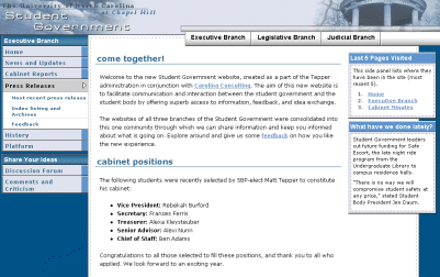
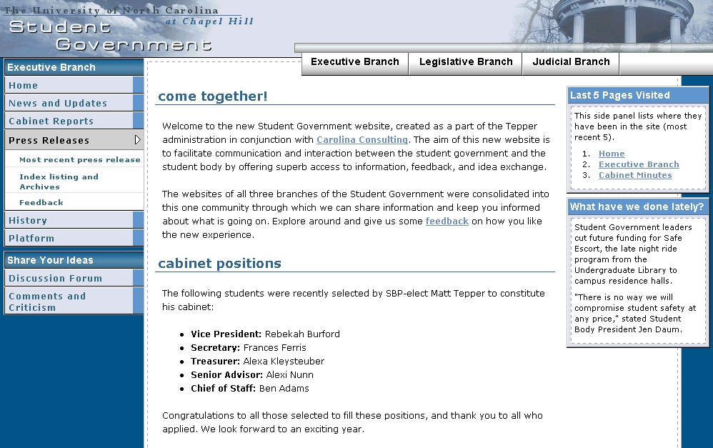
| Accessible Site Prototype |
|---|
|
| View Site Prototype: as designed using compliant XHTML, CSS, and accessibility techniques. |
| Screenshot: to see the site's presentation as rendered using CSS and XHTML. |
| Validation: Valid XHTML 1.0 Strict (0 errors) |
| Section 508: Bobby 508 Approved = 0 errors |
| WCAG: Bobby AAA Approved = 0 errors |
| Code Ratio: 3.17 = (6,228 / 1,959) |
Source Code
Benefits and Tradeoffs:
- This site passes the accessibility tests with flying colors. This in itself is a huge step forward for student organization sites.
- The layout is one that I could not actually achieve using the outdated table layout methods. Already universal Web design pays off.
- The tab progress and the hidden navigation links allow users with screen-readers to browse the content easily.
- There is a pure separation of content from form, which will be important in the future as new administrations arrive and want to change the appearance of the site without changing how the site functions.
- On the downside, the site is black and white in Netscape 4.0-, which is currently the default browser in all our older computer labs. There are rumors that the labs will all be upgraded soon, so all computers will have the newest versions of Internet Explorer and Netscape loaded. Of course, the site technically degrades well to Netscape -- it functions just fine. However, it is understandably boring, which is somethign that we do not want for a site that may be used a lot (and by students who do not care about XHTML or accessibility). If anything, the student government's support of the new site may be incentive for the upgrading process to occur.