Prototype 2: Weather.com
Overview
Weather.com, home page of the Weather Channel, is a vital Web resource for most people surfing the Web. However, the design of the site has remained consistently inaccessible and, for the most part, visually sub-par for years. Rather than picking a news site as my next project, I decided to attempt a reengineering of the Weather Channel's site to continue to push the boundaries of universal Web design.
Disclaimer: All graphics and text used in this prototype belong to and were originally created by Weather.com. They are used in this exercise merely as a demonstration of a certain design technique, and the criticisms or viewpoints discussed herein do not reflect those of Weather.com.
Process and Results
As with SpaceX, I picked apart this site using screenshots instead of using the existing code. I stuck with the original widths rather than attempting to make the site dimensions relative (percent-based, rather than pixel-based), and started the design with a single width delimiting block. I added the top rows, including an inline unordered-list for the top navigation links, and created the necessary banners and search boxes. Then I divided the remaining space into two columns, created a CSS class for a content block, and began making the substyles I would need to achieve the desired effects of each block.
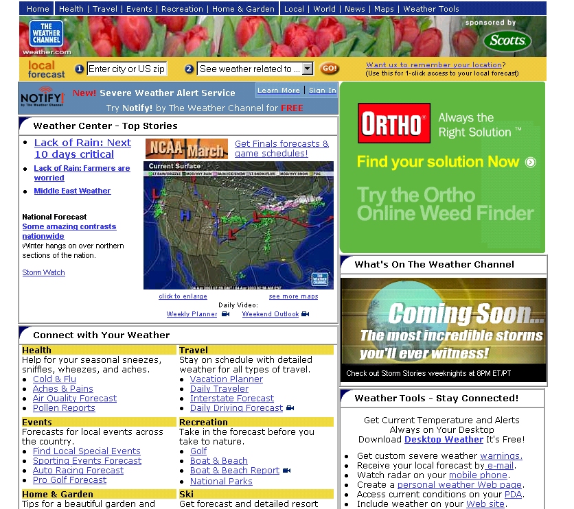
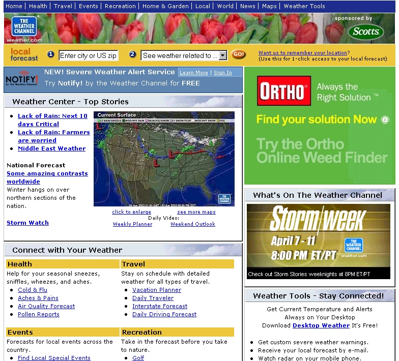
| Original Site | Accessible Site Prototype |
|---|---|

|

|
| View Original Site | View New Site: as redesigned using compliant XHTML, CSS, and accessibility techniques. |
| Original Screenshot: to see the site layout if you have an old browser. | New Screenshot: to see the new presentation as rendered using CSS and XHTML (the IE rendering). |
| Validation: This page had 184 HTML 4.0 Transitional errors and 977 XHTML 1.0 Strict errors (1.86 errors per line). | Validation: Valid XHTML 1.0 Strict (0 errors) |
| Section 508: 41 errors, 167 user checks (test). | Section 508: Bobby 508 Approved = 0 errors |
| WCAG: 187 errors; 35.6% of lines of code contain errors (test). | WCAG: Bobby AAA Approved = 0 errors |
| Code Ratio: 13.54 = (38,693 / 2,857) | Code Ratio: 3.89 = (3,804 / 14,807) |
Source Code
Benefits achieved from the redesign:
-
As shown above, accessibility and compliance measures improved tremendously:
- 977 XHTML 1.0 Strict validation errors dropped to zero (full Strict compliance)
- Full WCAG 1.0 and Section 508 compliance (down from 147 and 41 errors, respectively)
- Code ratio (number of bytes of HTML needed to produce one byte of text onscreen) declined nearly 80% to 3.89
- All navigation links are now more structurally sound, since they are represented as lists rather than table data.
- The text is now scalable since it uses CSS percent sizing rather than absolute pixel sizing. Thus, in the normal viewing mode, the font is small -- as the original designers intended -- but the entire layout holds up quite nicely as the font size is increased.
- After some experimentation, the site looks nearly identical in Mozilla-based browsers and Internet Explorer 5.5 and above (the ones that support style sheets).
- The content is now marked up logically -- using lists, headers and paragraphs, and marked-up tables (captions, headers, row and column groupings -- to make it more accessible to the blind. For instance, the blue row of navigation links are now more structurally sound lists, as opposed to table data.
- The original layout was not very consistent: widths of the banners and content boxes varied as you go down the page, and the borders and rounded tabs used to "decorate" the content blocks were clunky and unattractive. The redesign imposes a more elegant width on all the elements (in other words, you could trace a straight line down each side of the web page). Furthermore, the headers and borders of each content block are more smooth and attractive.
Tradeoffs required to make the site accessible:
- Due to the way they margins, padding, and borders, IE5.0 and IE5.5 do not render this site correctly. The right column widths are rendered incorrectly, causing them to flow down the page below the last cell on the left side.
- In a CSS-incompatible browser like Netscape 4, this site renders just fine, but the sheer amount of information stored in columns makes the page difficult to read. This would be avoided if I structured the content in an entirely different manner.
- Due to the method I used to center the content of the site (basically, I set the left coordinate of the 770px wrapper to 50% of the window size, and I made the left margin -365px), the entire page does not show up on screen when the window size is less than 770px -- it bleeds outside the left boundary of the browser window. If I were to actually implement this site, I would probably choose not to center it.
Summary and Conclusions
I chose this site to re-engineer because I knew it would be difficult. The resulting visual site, coupled with accessibility features and better validation statistics, is a very powerful testimony for the strength of universal design. While the original Weather.com site was not the most elegantly-structured site on the market, it was complex and contained a lot of information. The XHTML/CSS copy is somewhat more attractive, but that was not the point; the purpose of this exercise was to demonstrate the flexibility that can be achieved through creative use of style sheets.
All in all,
Weather.com should buy this code from me. The text is scalable; the site looks better but still achieves their vision; and it is universally accessible.