Prototype 1: SpaceX
Overview
I discovered this site when I checked out the recent portfolio of 2advanced Studios, which produces pretty slick Flash-based commercial websites. I found the recent addition of Space Exploration Technologies, visited the site, and found it to be a viable candidate for backwards engineering.
Disclaimer: All graphics and text used in this prototype belong to and were originally created by Space Exploration Technologies and 2Advanced Studios. They are used in this exercise merely as a demonstration of a certain design technique, and the criticisms or viewpoints discussed herein do not reflect those of the Space Exploration Technologies or 2Advanced Studios.
Process and Results
To re-engineer the site, I began taking multiple screen shots to capture the needed images. I opted to ignore the Flash movies and just used images in their place. I then ported the content into a basic HTML format with simple header, paragraph, link, list, and div markup. I then wrote the style sheet to mimic the desired effect.
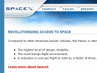
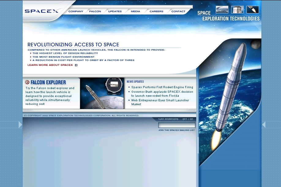
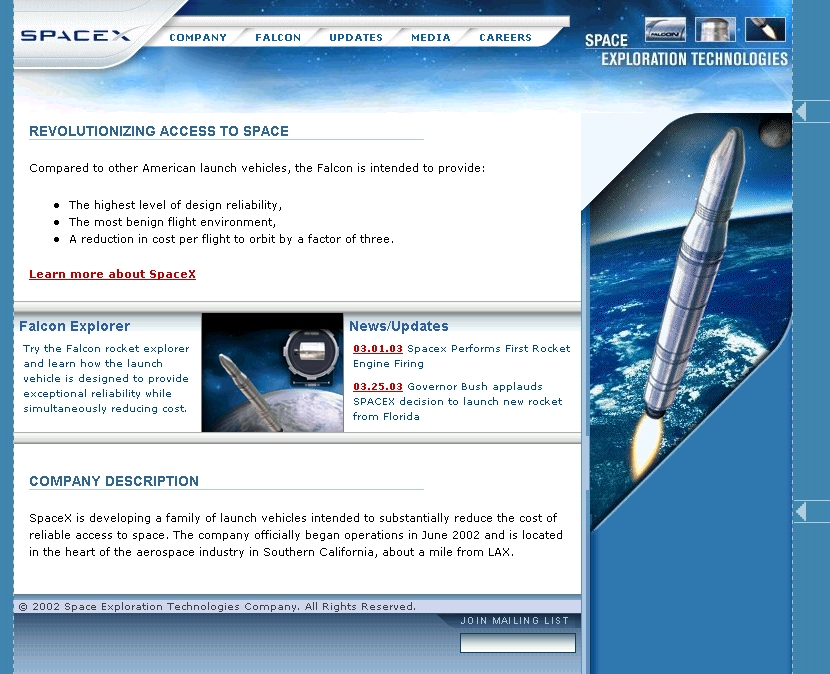
| Original Site | Accessible Site Prototype |
|---|---|
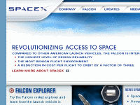
|
|
| View Original Site: as created by 2advanced (currently active site) | View New Site: as redesigned using compliant XHTML, CSS, and accessibility techniques. |
| Original Screenshot: to see the site layout if you have an old browser. | New Screenshot: to see the new presentation as rendered using CSS and XHTML. |
| Validation: this site is designed using frames, so it is difficult the measure the XHTML 1.0 and HTML 4.0 errors because the Validator is always redirected to the frames page, which does not reflect the entire site. | Validation: Valid XHTML 1.0 Strict (0 errors) |
| Section 508: ? | Section 508: Bobby 508 Approved = 0 errors |
| WCAG: ? | WCAG: Bobby AAA Approved = 0 errors |
| Code Ratio: ? | Code Ratio: 2.62 = (5,711 / 2,180) |
Source Code
Benefits achieved from the redesign:
- The accessible site no longer uses frames and JavaScript to achieve the desired effect. All information and graphics are manipulated using CSS, leaving the content separate from the presenatation.
- Much of the original text content consists of images that lack both alt text and longdesc text, making the sites unreadable. The new site provides full screen-reader access to all text elements.
- The text is now scalable since it uses CSS percent sizing rather than pixel sizing or image maps. Thus, in the normal viewing mode, the font is small -- as the original designers intended -- but the entire layout holds up quite nicely as the font size is increased.
- The site is supported by all browsers, and if we apply new style sheets, we can degrade the physical presentation to allow it to be viewable on handheld devices.
- The content is now marked up logically -- using lists, headers and paragraphs, and marked-up tables (captions, headers, row and column groupings -- to make it more accessible to the blind. For instance, the gradient bars above and below the middle news section are now logical dividers (as far as HTML is concerned) with the background gradient applied to them rather than static images.
- The overall visual effect, minus the flash movies, is nearly a carbon-copy of the original.
Tradeoffs required to make the site accessible:
- I could not devise a way to center the site without abusing HTML or CSS. However, I think this does not degrade the user experience at all.
- The background texture map was left out.
- Obviously, the compliant version does not include the Flash movies. I chose to leave them out for the purpose of time, although an equally accessible site could be designed using Flash and the new accessibility features offered in Flash MX.
- If the text does not entirely fill up the screen in the vertical direction, the page cuts off. I was unable to create the fading gradient effect used in the original site (which was accomplished using dummy frames).
Summary and Conclusions
To illustrate the power of abstracting the page content from its style/presentation, I have included a feature that will let the visitor remove the style sheet to see how the site would look to a screen-reader or to an older browser such as Netscape 4. Return to the prototype site, click on the "Careers" link at the top in the navigation bar, and observe the structured content. To return to the styled page, click on "Media."
Of course the un-styled version of the prototype is dull and boring, but it illustrates the value of universal design. A complex, visually appealing site can still be designed using proper (X)HTML markup without having to abuse HTML, tables, images, frames, and JavaScript to provide the visual presentation.
All in all,
I think this was a successful prototype exercise. It clearly illustrates that creativity need not be stifled in the pursuit of accessibility. By sticking to clear XHTML, solid CSS markup, and universal-mindedness, one can even improve fantastic visual sites that are nearly inaccessible to the disabled user or one using an alternative viewing device. The ratio of code to content can stay low, thus reducing bandwidth load; full compliance with XHTML, CSS, Section 508 and WCAG standards can be achieved; and the designer can provide a very appealing and pleasurable experience for all users.